McDonald’s. Nike. Google. Coca-Cola. What do these brands have in common? As you read their names, you probably pictured their logos. That’s exactly what should happen when you think about a brand.
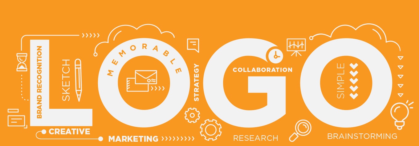
Logos establish brand recognition among customers—once you see a logo, you become familiar with what it represents. As the identity and “face” of a company, a logo is used in every single strategic marketing design, from stationery items (business cards, letterhead, etc.) to print and digital promotional advertising.
I read “Logo Design Love” by David Airey to learn more about logos, and I finished the book with a few takeaways that I use when I design. To create a logo that best represents a brand, the design should be simple, versatile, memorable, focused, and appropriate.
Simple and Versatile
Simple logos are easily recognizable and versatile enough for use across multiple media and applications. No matter where and why the logo is used, it should help tie all brand elements together. Therefore, you should consider these ideas throughout the design process:
- Can the logo be printed in one color, and in black or white?
- Can the logo reduce in size, and still be effective in as little as one square inch?
- Is the logo easily recognizable?
- How would the logo look on a billboard, a shirt, an envelope, etc.?
Memorable
In a society where nobody reads anymore, logos need to be quickly identifiable. People recognize color first, shape second, and typography third. This means logo color is very important and should relate to the company brand. In terms of shape, if a logo cannot be re-drawn accurately in fewer than 10 seconds, it is too complex, which decreases the chance it will be memorable.
Focused
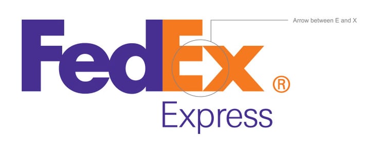
Focusing on a single, specific design treatment helps a logo stand out to its audience. A great example of focus in a logo is FEDEX. The logistics company is about shipping products fast and reliably. Lindon Leader, the designer of FEDEX logo, focused on arranging the E and X to create an arrow, a symbol of speed and precision.
Appropriate
What does the logo represent and who is the intended audience? If the logo is for a nursing home, it could represent the idea of providing a healthy, loving home with a caring staff. A futuristic font, intense colors, complex shapes, and sharp edges and angles may not work well in this case. Note that being appropriate does not mean being literal, depicting exactly what the company does. For example, a paint company logo does not need to incorporate a paintbrush.
A solid logo and brand identity that follow these criteria can help launch a company and enhance its ability to successfully market their brand. David Airey said it best: “A successful design may meet the goals set in your design brief, but a truly enviable iconic design will also be simple, relevant, enduring, distinctive, memorable, and adaptable.”