Unless your site is blank, it’s got fonts all up on it. Maybe you paid for them. Maybe the developers did their thing, and that was the end of it. Maybe you’ve never thought about it.
By learning how your fonts are sourced, you can make your site more robust, faster, and cheaper. Fonts come from three possible places:
1. Somebody else’s server
2. Your server
3. The user’s device
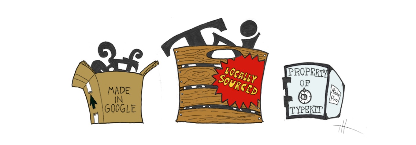
1. Somebody else’s server: Font hosting services
The biggest is Google Fonts, offering fonts with open-source licenses. This may be the only free font host today—it drove others out of business. Paid services like Cloud.typography, Typekit, and fonts.com require you to pay, but they boast more selection. For example, Google Fonts’ Garamond lacks bold and italics, which is limiting. Paid hosts’ broader choice also helps prevent your site from becoming the six-millionth design with Open Sans or Lobster.
Pros
- Sometimes, the font you want forbids self-hosting. You need to find a third-party host who has it, or settle for a lookalike.
- If you don’t have much developer muscle, hosts do well riding the cutting edge. Google Fonts was an early adopter of Zopfli, WOFF 2, and unicode-range, and others weren’t far behind.
- The biggest pro: ease of use. One snippet of code to copy/paste, and you're done. Unfortunately, that default may not be good enough, which brings us to…
Cons
- You can’t change the font delivery. For example, Typekit splits fonts into separate files, which is how they “protect” them. That means more overhead and longer downloads. And if one file hiccups, your site can look like a ransom note. Typekit’s other obfuscation methods have similar side effects.
- No matter how fast, hosts need DNS lookups to load—most have two. One DNS query alone eats up to 1.25 seconds on cellular data and increases chances of failure. With HTTP/2 obsoleting domain sharding, extra DNS lookups have no upside. And if your site is HTTPS (which it should be), users endure a TLS handshake for each DNS lookup.
- Adblockers, privacy extensions, and security-conscious users can block font hosts, which double as trackers. Some also bring their own JavaScript analytics. Rude.
- Some paid hosts bill per view. If you get more traffic than expected, you’ll pay more than expected.
2. Your server: Hosting fonts yourself
You can download free-license fonts from FontSquirrel, or from Google Fonts (instead of pasting their code snippet). With free fonts, you get what you pay for—free fonts sometimes lack variants, look shoddy on Windows, or kern badly.
Professional fonts are available to purchase from foundries like Typotheque, Fontspring, TypeNetwork, FontShop, or MyFonts. They offer free trials, so you can see how the fonts look before committing to the cost.
Pros
- Without DNS lookups, fonts download as fast as you serve them.
- Blocker software allows fonts from your site. Today, with iOS Content Blockers, privacy-enforcing browser extensions, and built-in tracking protection, respecting privacy keeps your site looking sharp.
- For me, the biggest pro is that self-hosting has maximum flexibility:
- You can inline fonts in the HTML to ensure look and feel while staying blazing fast. New hotness like link rel="preload" is also available.
- License permitting, you can optimize by subsetting, dropping OpenType features, and omitting hinting for platforms that don’t use them.
- You can add flourishes with CSS font stacking, substitute lowercase characters with capitals for accessible all-caps, and other creative touches.
Cons
- If the font isn’t licensed for self-hosting, you can't use it. You’ll have to compromise with a lookalike, or find a paid host who has the font.
- If your hosting company charges by data transfer, then you pay for font bandwidth. But with optimization and caching, this can justify the increased speed and reliability: an entire font family can be smaller than one image file.
3. The user’s device: Fast, free system fonts
Before webfonts, pages listed acceptable fonts and hoped the user’s device had one installed. The thought of this can send designers into existential terror, but users don’t care: if they can read, they’re happy. A common practice is to use system fonts for body copy and a webfont for jazzy headings. This enables fast, readable main text, plus enough personality to feel unique. Even if you go 100 percent webfont, be sure to choose fallbacks for when networks go bad. Browsers show fallbacks if webfonts don’t load in time.
Pros
- This is as fast as it gets—no downloads, ever.
- System fonts respect data plans. Some users shut off web fonts to save bandwidth, so good system font fallbacks are important. Otherwise, behold the default uggo serif.
- It costs $0 moneydollars. There's nothing to buy, rent, or license, and your bandwidth bill stays lean.
- If you want to look like part of the user’s OS, you need system fonts.
Cons
- There's no perfect consistency. Helvetica and Arial are similar, but they're different enough that type geeks yowl if they notice Arial cramping Helvet’s style.
- Choice can be limited. The options for body copy are more varied than just Verdana and Georgia, but condensed, ultralight, ultrabold, and other fancy faces are rare and may need finagling with @font-face { src: local() }.
- More research and testing may be advisable. I recommend iOS Fonts, Font Family Reunion, and Zach Leatherman’s list of system fonts.