.jpg?width=1360&height=475&name=Header_1360x475%20(1).jpg)
Do you ever feel your brand isn’t standing out from other competitors? Maybe it is time for a brand refresh. A great way to refresh your brand is through color, since it stimulates emotions, feelings, and experiences. After all, 93 percent of consumers purchase products based on visual appearance.
The right color combination can elevate your brand to the next level using cohesive palettes. In this blog, I’ll share a few simple practices on how to create a new, effective palette to refresh your brand.
Get inspired!
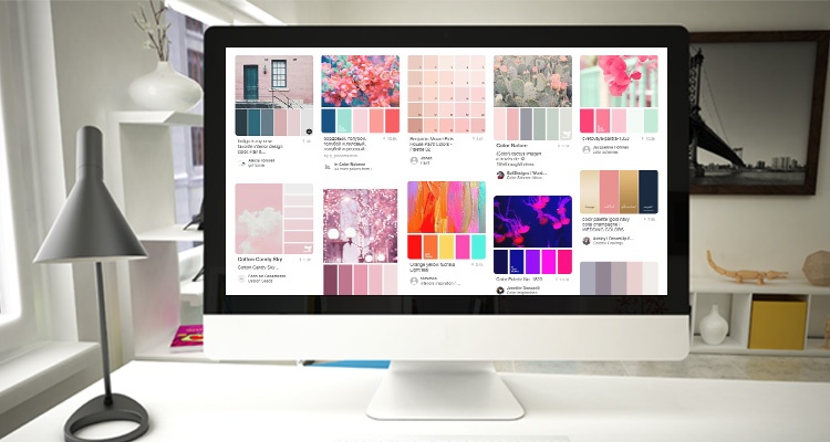
Color can help engage an audience, but first you need to know what colors work well together, and what will work best for your brand. A great way to determine the color of a brand is to gather a lot images and inspiration that represent the look and feel you want your brand to achieve. If you’re doing a brand refresh, also experiment with a few variations of the brand’s existing colors. Eventually you will see a trend in the colors you gravitate towards and the mood you want to set. You could create your own mood board, or use one of these great color generator tools: colourlovers.com and paletton.com.
Pro tip: There are many ways to find color inspiration such as nature, food, patterns, etc. The best results come when you completely immerse yourself in your environment.
Evaluate your options.
Once you have a few colors picked out, now it’s time to play with some color combinations. Consider the following color schemes as you experiment and remember: “All colors are the friends of their neighbors and the lovers of their opposites.” —Marc Chagall.
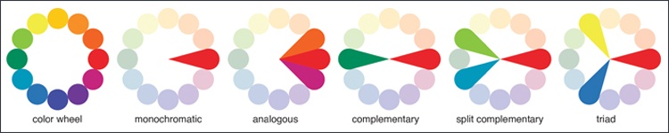
- A monochromatic color scheme is one color from the color wheel with varying tints, shades, and tones. To achieve tints, shades, and tones, add white or black.
- An analogous color scheme is three colors next to each other.
- A complementary color scheme includes two colors directly across the wheel from each other. These colors create high contrast colors, but can be very bold when designed together.
- A split complementary scheme is like complementary colors but include two colors directly from the opposite side.
- A triad color scheme is evenly spaced colors around the color wheel.
Refine your selections and produce your brand colors.
When we create color palettes, there needs to be contrast between colors to help the hierarchy of the design. Once we have our core colors, also known as your primary color scheme, it is time to step back and evaluate the tones and shades. Do we need to add a darker or lighter color in the mix to increase contrast between the colors? Also, do not forget about neutral colors! Neutral colors create balance, complementing dominant colors that stand out and quickly grab viewer’s attention.
In the end, you want two to four primary colors and four to six secondary colors. Use your secondary color palette as accent colors. For example, a great way to use accent colors is for CTAs and items you want to draw attention to. Our goal is to create harmony between colors—not too loud, busy, or boring.
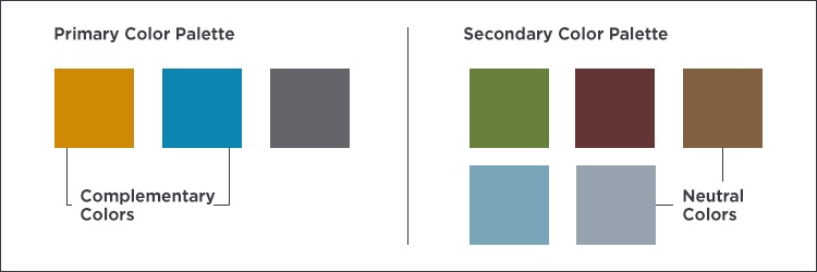
Pro tip: Do not use all the colors in color palette at once. It is best to mix and match between your primary and secondary color palettes. Mixing between palettes creates flexibility in your brand while keeping it fresh.
It’s important to keep in mind that when looking to refresh your brand, color may not always be the answer. But it is a way to breathe new life into your brand, and these tips can help you create the right color palette effectively!